It’s difficult to stop busy people in their tracks. You’re lucky if they even notice your store in their daily travels. To attract positive attention to your store you need to have eye-catching displays.
The six most important design elements to get people to stop and look are color, angles, movement, simplicity, repetition and imagination. Use a combination of any two of these and you will have a successful interior or window display.
Color
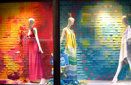 Color is the first element that attracts attention in a store window. Warm colors pop while cool colors recede.
Some of the strongest color combinations include the following:
- Black and white with a bright accent
- Any monochromatic color combination such as pink hues ranging from light to dark
- A neutral with one or two bright colors
- All white or all black with an accent is strong as long as the wall color is in contrast
If the “see-through” into your store seems dark, dark merchandise in the windows will be lost unless you use a light backdrop to show off the product. Light or bright pieces work much better when the background is dark toned. If your merchandise is mainly neutral or subdued tones, try using bright backgrounds, props or accessories.
Angles
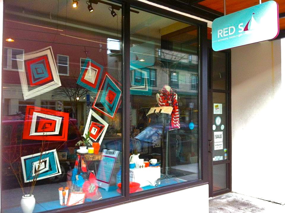
Angles lead a customer’s eye to wherever you want them to look. An angle in your window or on a wall display or shelf can be made of many different things such as varying levels of props and merchandise. Make sure that whenever you use an angle in a presentation, that the angle leads the eye to something you want to sell. In your window, the angle should lead the eye to your front door. On a shelf, it should lead the eye to more merchandise or to the cash wrap.
Movement
Another way to capture attention is through movement. Movement comes in many forms. A fan blowing a lightweight fabric is easy and inexpensive. Put a train in a window or on a shelf, and you will have people stopping and staring — at the train first but then at your merchandise display. Movement can be created by blinking lights but be aware that depending on the lights and the blinks, this idea can be either great or really tacky.
Simplicity
The key to sophisticated window and interior display is to keep it simple. If your store caters to an upscale market, keep your displays simple and elegant. The more merchandise that is packed into a window or on a shelf, the less it seems to cost. Space equals cost.
Repetition
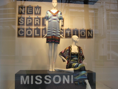
Repetition is another way to attract attention. By visually repeating an image or product, you say, “we believe in this.” The courage of a repetitive idea has a strong influence on the customer. If a store believes in this ____ enough to show five in the window or on a shelf, this must be an important, hot item! Have fun with repetition.
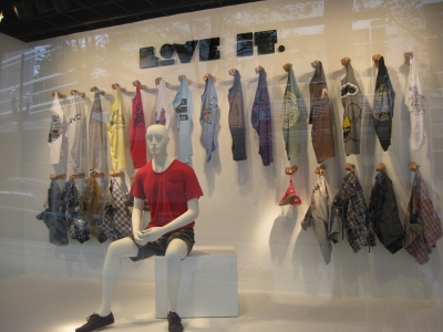
Allow one of the repeated props or items to be slightly askew or offset with an unusual prop or accessory. Remember, when putting a number of items in a window, odd numbers are always more dynamic and interesting than evens.
Imagination
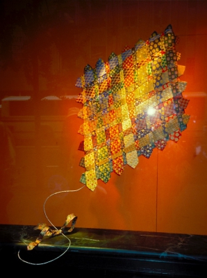 Imagination is what sets apart the good from the great. Look around at displays you think are interesting and imaginative. See what other people have come up with to express their ideas and get inspired by other’s creativity.
Look at all aspects of the merchandise and then have some fun with it. Imagine the items as a child may perceive them or as interpreted by a fine artist. There are endless ways to show your products with a fresh and imaginative twist.
If you want people to stop, look and shop, think what you can do to add color, angles, movement, simplicity, repetition and imagination to your window display.
This post was contributed by our partner Linda Cahan. Linda is an internationally recognized expert in visual merchandising with over 35 years of marketplace experience.
Linda’s breadth of experience is in all segments of retail working with hundreds of independent retailers as well as retail corporations as a visual merchandising and store design consultant. She has been featured on MSNBC’s show “Your Business” in a show about the importance of window displays.
Linda gives seminars on a wide variety of retail topics nationally and internationally, is a member of the National Speakers Association, trains retailers in Visual Merchandising and writes for several B-to-B retail magazines. She has been a columnist for Gifts and Decorative Accessories magazine for 16 years and “Spa Retailer” for 6. Linda is the author of: “100 Displays Under $100”, “Feng Shui for Retailers”, “A Practical Guide to Visual Merchandising” as well as eight custom corporate visual standards manuals for major corporations in the USA and South America: including American Express, Singer, Saks Fifth Avenue, United Rentals, and Lancôme Cosmetics.
Currently, Linda’s expertise is shared part-time with students at The Art Institute of Portland, OR. Formerly, she taught at Parsons School of Design in NYC for 12 years. Learn more about Linda Cahan at www.lindacahan.com or www.lindacahanseminars.com.


![Make Product Presentation a Priority [INFOGRAPHIC]](https://www.testsr.com/wp-content/uploads/2020/08/Make-Product-Presentation-a-Priority-INFOGRAPHIC-500x383.jpg)


Leave A Comment